What Architecture of Radio actually does (from store listing)
The infosphere, Visualized.
Every time we use our phones, tablets or laptops we are entering an invisible world of wireless digital signals. It is a world that we cannot see but that is literally all around us.
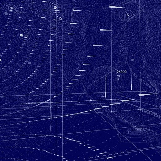
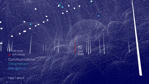
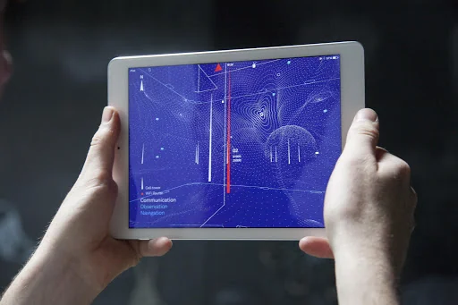
The Architecture of Radio is a 360 degree data visualization of what this world might look like. It shows the cell towers, GPS satellites and Wi-Fi routers around you that allow us to live our digital lives.
"Fascinating and beautiful" – PCMag
"Enter The Matrix!" – Fast Company
"…
Every time we use our phones, tablets or laptops we are entering an invisible world of wireless digital signals. It is a world that we cannot see but that is literally all around us.
The Architecture of Radio is a 360 degree data visualization of what this world might look like. It shows the cell towers, GPS satellites and Wi-Fi routers around you that allow us to live our digital lives.
"Fascinating and beautiful" – PCMag
"Enter The Matrix!" – Fast Company
"Both beautiful and slightly disturbing" – Business Insider
"the sight of this invisible world is breathtaking" – Gizmodo
"an entirely new lens through which to view the [reality] we have, but rely on every day." – Boston Globe
"Fascinating." – NYTimes.com
Why should I use this app?
Out of curiosity! We are increasingly dependent on a global ecosystem of digital signals. We use them for so many things, yet we cannot see them. We can see the roads we use to travel, the buildings we live in, but not the infrastructure that is changing the world. How can we understand this world without understanding how it works?
The purpose of this app is to make the invisible visible so we can look at it, think about it and discuss it.
Why Should I not use this app?
This app is not a measurement tool. It’s purpose is to inspire, to see the world through a different lens. The app is based on real world data and gives you a pretty good idea of the density of digital signals around you, but it won’t tell you where to move the couch to get a better WIFI signal.
So how does it work?
The Architecture of Radio is a data visualization, based on global open datasets of cell tower, Wi-Fi and satellite locations. Based on your GPS location the app shows a 360 degree visualization of signals around you. The dataset includes almost 7 million cell towers, 19 million Wi-Fi routers and hundreds of satellites.
Is this really what radio signals look like?
We can’t see radio with our eyes. The waves that we use for our cell phones and Wi-Fi are way outside the spectrum of visible light. In order to “see” radio, it has to be interpreted or translated into an image that we can see. There are many ways to do that but it will always be an interpretation.
The Architecture of Radio is an impression of the infosphere, a way of seeing it.
Comparable Android apps
The five apps in Education with the closest revenue to Architecture of Radio. Click any to see its detail page.
Each forecast combines App Store rating, ratings count, monetisation model, pricing tier, IAP signals and ad-supported flag.
The base estimate is then multiplied by a per-category scaling factor learned from apps with founder-verified MRR.
Every number on this page comes from public APIs and bumetric's own snapshot history.
Full methodology covers input variables, accuracy bands per category and how we treat apps without comparable anchors.
See also the live data on Architecture of Radio's tracker page for current rating, reviews and snapshot timeline.
Building something similar? Get a free AI audit with $-revenue forecasts for every recommendation.


 Exam Preparation: Live Classes
 Testbook: Exam Preparation App
 常春藤核心英文字彙, 正體中文版
 大家學標準日本語:中級本
 French Class